Wednesday 16 December 2015

Emulation: Felicita Sala

Here is my emulation of Sala's work. I took the style in which Sala works in and used it to draw one of my photographs of New York. I like this style as it uses bright colours and messy lines to create an exciting and characterful image.


Emulation: Stig Lindburg

I printed out some photos of well known buildings in New York. I then cut them out and arranged them on paper.


I scanned the page into Photoshop and used Threshold so that the image was in black and white. I then used the Magic Wand Tool to get rid of the white and I created a white rectangle to place behind the existing layer.


I then changed the opacity of the buildings so that I could still see a faint outline to paint over. I used bright bold colours like Stig Lindburg and painted in the base colours with the Brush Tool.


After that, I filled in the detail such as windows and shadows with contrasting bright colours that were taken from my Lindburg copy.


Here is the finished emulation:


Wednesday 9 December 2015

Colour Drafting

I have created drafts to get an idea of how the colour would look on a couple of my book pages. I used Photoshop to add colour and shading.

Tuesday 1 December 2015

Handwritten Type

I drew out some of my own ideas for typefaces. I experimented with different variations of type, altering points such as weight, sizes and transitions.


Friday 6 November 2015

Copy: Stig Lindburg

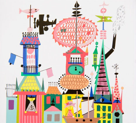
I decided to copy an illustration by Stig Lindburg.

Here is the original:
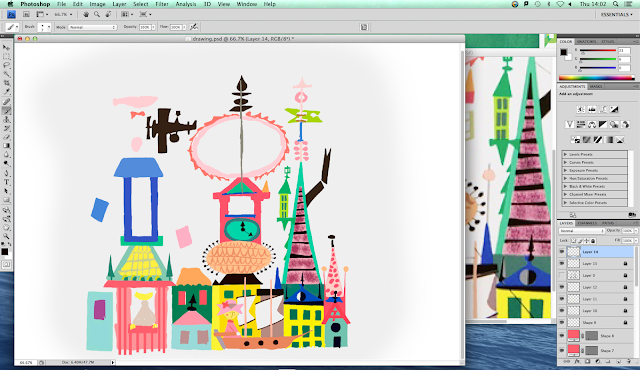


Here is my copy:


I started off by drawing an outline of the illustration on a piece of paper. I then scanned it into Photoshop and changed the threshold so that I could clearly see the lines. 


I then created a white layer to go under the outline's layer. I used the Magic Wand Tool to get rid of the white around the outline so that I could take away the outline later on. 

I started to add colour with the Brush Tool. I got the correct colours by using the Eyedropper Tool and selecting the colour from the original illustration.

 When I had painted in all of the base colours, I took away the outline and started to neaten up the edges by touching them up with the Brush Tool.


I then started to add in the detail.


Thursday 5 November 2015

Mid-Point Drafting

These are larger and more detailed versions on some of the scamps that I created previously. I chose four of the scamps that I thought were the best and will use one of these as my final cover design. 


Front Cover Mid-Point Drafting

I drew out some of my favourite front cover scamps in more detail. This is so that I can see which cover looks the best and finally narrow it down to the cover I will use in my final. 


Wednesday 4 November 2015

Scamps


I drew out some scamps for my children's book cover. I sketched out my ideas to compare and decide which one I will use and develop for my final design.


Tuesday 3 November 2015

Character Development

For my character development, I started off by drawing out a page of different styles of bears. I coloured them with watercolour.


I then chose a bear that I liked the look of and developed his look. I drew him out in different positions and in slightly different styles.


I then chose the bear that I liked best and drew it out in different positions for reference when I make my final book.


Sunday 1 November 2015

Flat Plan for 'Time to Travel'

Here are my scamps for the layout of my children's book. I've done this to get an idea of how I want my book to look. I will develop a couple of pages from the scamps.