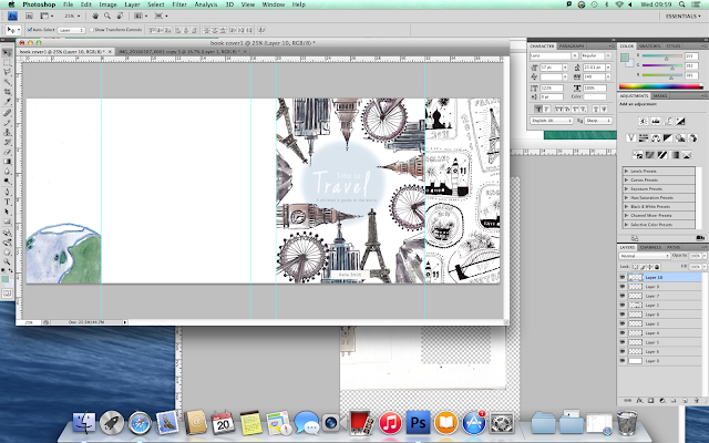
For the right hand flap on my children's book cover, I drew a selection of stamps from around the world with fine liner pen. I then scanned them into the computer and imported them into Photoshop. I selected 'Threshold' to turn the drawings to black and white and then used the Magic Wand Tool to get rid of the white in the illustrations so that I can easily overlap them if needed.
I arranged the stamps so that they filled the page but at the same time didn't make it too crowded. I tilted some of the stamps so that they didn't look so ordered.
For the second flap, I used the same stamp background but lowered the opacity so that it was subtle. I then added an illustration of the Earth and altered the saturation, contrast and exposure so that it didn't look so pale.
I wrapped text around the top of the Earth drawing by creating a sphere with the Shape Tool and then attaching the text to the path of the shape. I then made the text blue to match the blue outline of the Earth.
I originally created an opaque rectangle to go behind the text on the left hand flap but then later changed it so that it wasn't so strong. I changed it to a blue opaque circle to link in with the front cover, making it more relevant and not so harsh looking.


No comments:
Post a Comment