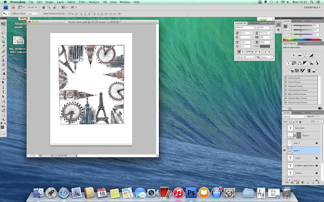
Here is my final front cover for my children's book.
I chose this design because it has an unusual layout and therefore would stand out against other books. All of the landmarks are positioned so that they lead the reader's eye to the centre - where the title is placed.
I started making the cover by drawing out some of the world's most well known landmarks around the edge of the page. I then coloured them with watercolour and drew in the detail with a fine liner. I scanned the page onto my computer and imported the image into Photoshop.
Once in Photoshop, I created a white rectangle to use as a background and used the magic wand tool to get rid of the white from the layer with the illustrations. I then altered the appearance of the illustrations by changing the levels, contrast and brightness. I made them appear slightly more colourful and hold more contrast than the original image die to the fact that the raw image looked dull in colour.

After that, I created a circle to sit behind the title which I feathered to create a softer transition between the blue and white. I then added a white title in the centre of the circle where the reader's eye will immediately be drawn to. I gave each line of text different font sizes so that they contrasted with each other to give the text a larger sense of readability.
Finally, I added the authors name in a white rectangle at the bottom of the page. It's in a simple sans serif font so that it doesn't draw too much attention away from the subtle title and illustrations.


No comments:
Post a Comment