Friday, 6 May 2016
Friday, 29 January 2016
Book Cover: Back + Spine
Here is the final full book cover:
For the back cover, I started by importing the drawing of the bear and the suitcase into Photoshop. I positioned them at the bottom of the page and tweaked the saturation and levels to make the colour richer. I then added a blurb and a header above the illustrations. I coloured them in blue to match the suitcase and chose a handwritten font to link with the rest of the text on the cover. Finally, I added a barcode in the bottom left corner as not to draw too much attention away from the main information on the page.
On the spine, I added the the title of the book and two illustrations that I copied off the front cover.
I then added the author's name after the title and the publisher's logo at the bottom. I changed the size of the author's name so that it was smaller than the title so that the reader's eye is drawn to the title first.
Book Cover: Flaps

For the right hand flap on my children's book cover, I drew a selection of stamps from around the world with fine liner pen. I then scanned them into the computer and imported them into Photoshop. I selected 'Threshold' to turn the drawings to black and white and then used the Magic Wand Tool to get rid of the white in the illustrations so that I can easily overlap them if needed.
I arranged the stamps so that they filled the page but at the same time didn't make it too crowded. I tilted some of the stamps so that they didn't look so ordered.
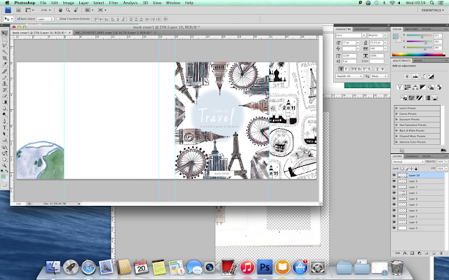
For the second flap, I used the same stamp background but lowered the opacity so that it was subtle. I then added an illustration of the Earth and altered the saturation, contrast and exposure so that it didn't look so pale.
I wrapped text around the top of the Earth drawing by creating a sphere with the Shape Tool and then attaching the text to the path of the shape. I then made the text blue to match the blue outline of the Earth.
I originally created an opaque rectangle to go behind the text on the left hand flap but then later changed it so that it wasn't so strong. I changed it to a blue opaque circle to link in with the front cover, making it more relevant and not so harsh looking.
Friday, 8 January 2016
Thursday, 7 January 2016
Book Cover: Front
Here is my final front cover for my children's book.
I chose this design because it has an unusual layout and therefore would stand out against other books. All of the landmarks are positioned so that they lead the reader's eye to the centre - where the title is placed.
I started making the cover by drawing out some of the world's most well known landmarks around the edge of the page. I then coloured them with watercolour and drew in the detail with a fine liner. I scanned the page onto my computer and imported the image into Photoshop.
Once in Photoshop, I created a white rectangle to use as a background and used the magic wand tool to get rid of the white from the layer with the illustrations. I then altered the appearance of the illustrations by changing the levels, contrast and brightness. I made them appear slightly more colourful and hold more contrast than the original image die to the fact that the raw image looked dull in colour.

After that, I created a circle to sit behind the title which I feathered to create a softer transition between the blue and white. I then added a white title in the centre of the circle where the reader's eye will immediately be drawn to. I gave each line of text different font sizes so that they contrasted with each other to give the text a larger sense of readability.
Finally, I added the authors name in a white rectangle at the bottom of the page. It's in a simple sans serif font so that it doesn't draw too much attention away from the subtle title and illustrations.
Wednesday, 6 January 2016
Inspiration
Here are some copies of other illustrators work. I did these so that I can draw inspiration from style, colour and technique.
Tuesday, 5 January 2016
Wednesday, 16 December 2015
Emulation: Felicita Sala
Here is my emulation of Sala's work. I took the style in which Sala works in and used it to draw one of my photographs of New York. I like this style as it uses bright colours and messy lines to create an exciting and characterful image.
Emulation: Stig Lindburg
I printed out some photos of well known buildings in New York. I then cut them out and arranged them on paper.
I scanned the page into Photoshop and used Threshold so that the image was in black and white. I then used the Magic Wand Tool to get rid of the white and I created a white rectangle to place behind the existing layer.

I then changed the opacity of the buildings so that I could still see a faint outline to paint over. I used bright bold colours like Stig Lindburg and painted in the base colours with the Brush Tool.
After that, I filled in the detail such as windows and shadows with contrasting bright colours that were taken from my Lindburg copy.
Here is the finished emulation:
I scanned the page into Photoshop and used Threshold so that the image was in black and white. I then used the Magic Wand Tool to get rid of the white and I created a white rectangle to place behind the existing layer.

After that, I filled in the detail such as windows and shadows with contrasting bright colours that were taken from my Lindburg copy.
Here is the finished emulation:
Wednesday, 9 December 2015
Colour Drafting
I have created drafts to get an idea of how the colour would look on a couple of my book pages. I used Photoshop to add colour and shading.
Tuesday, 1 December 2015
Handwritten Type
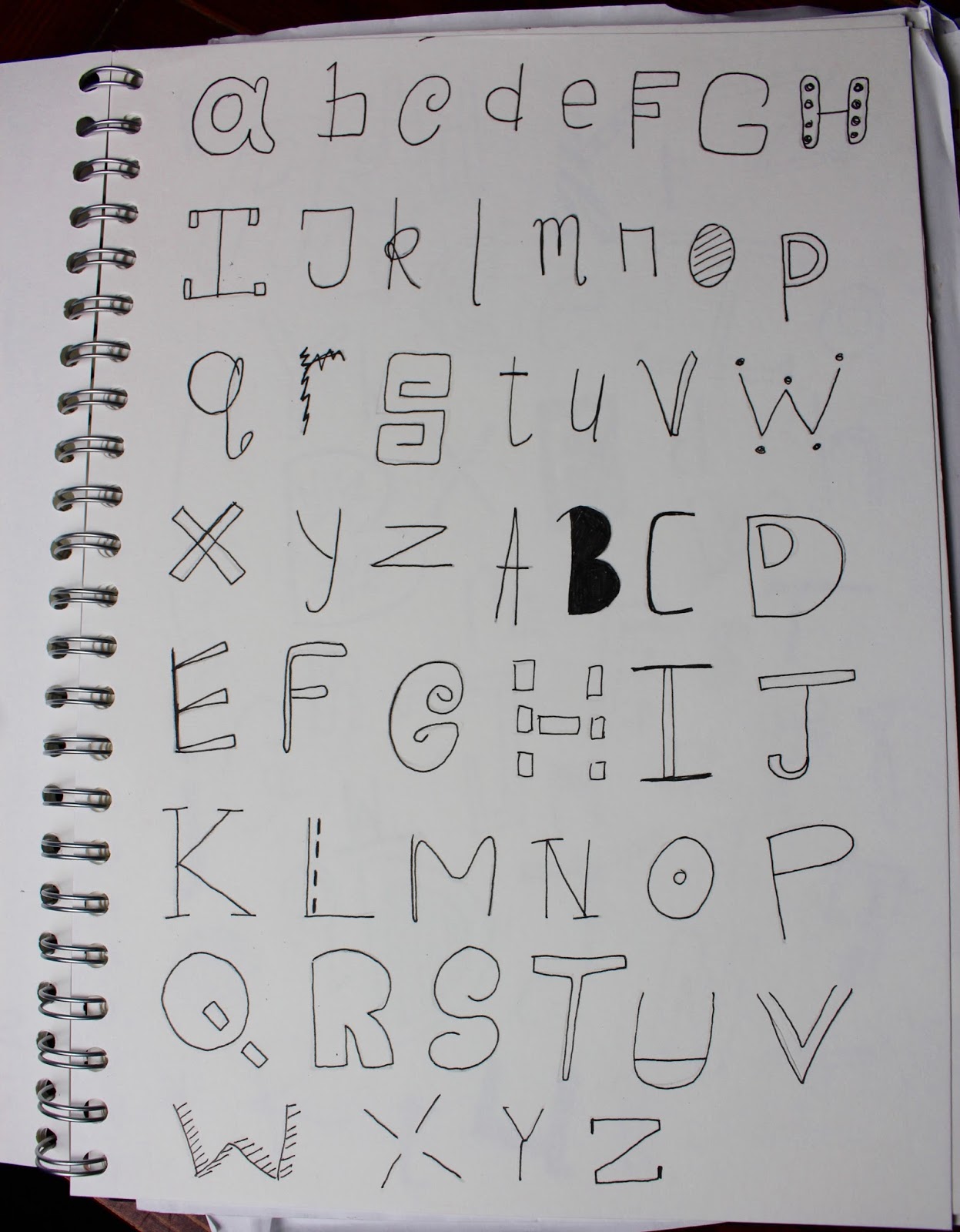
I drew out some of my own ideas for typefaces. I experimented with different variations of type, altering points such as weight, sizes and transitions.
Friday, 6 November 2015
Copy: Stig Lindburg
I decided to copy an illustration by Stig Lindburg.
Here is the original:

Here is my copy:

Here is the original:

Here is my copy:
I started off by drawing an outline of the illustration on a piece of paper. I then scanned it into Photoshop and changed the threshold so that I could clearly see the lines.
I then created a white layer to go under the outline's layer. I used the Magic Wand Tool to get rid of the white around the outline so that I could take away the outline later on.
I started to add colour with the Brush Tool. I got the correct colours by using the Eyedropper Tool and selecting the colour from the original illustration.
When I had painted in all of the base colours, I took away the outline and started to neaten up the edges by touching them up with the Brush Tool.
I then started to add in the detail.

Subscribe to:
Posts (Atom)